Arabic Calligraphy Exhibition at Saqiyah el-Shawiy

Ramadhan karim…kullu sanah wentum bikhair. Hari kelima bulan Ramadhan yang lalu saya pergi ke Zamalek. Tepatnya ke bawah kubri (jalan layang) di ujung kota tersebut. Markas Budaya “Saqiyah abdul Mun’im ash-Shawiy”. Beruntung sekali ada kawan Mesir yang memberi tahu bahwa hari ini adalah pembukaan pameran khot oleh “Jam’iyyah Mashriyyah Ammah lil Khattil Arabiy”. Selain itu ada pameran tunggal oleh khottoth Hasan Hasubah asal Port Sa’id, yang digelar hingga 10 Ramadhan.

Pameran kaligrafi tersebut dibuka untuk umum mulai kemarin Jum’at (5/09) hingga akhir bulan Ramadhan, mulai pukul 09.00 pagi hingga pukul 15.00 siang. Kemudian buka untuk kedua kalinya setelah tarawih, atau sekitar pukul 21.30 malam hingga menjelang sahur.

Tidak banyak sebenarnya karya yang dipajang, hanya saja beragam. Ada 10 orang kaligrafer yang berpartisipasi melalui karyanya dalam pameran ini. Dari kaligrafer senior seperti khattath Muhammad Hammam, Khattath Musthafa ‘Imari, Fannan Musthafa Hudair, Mahmud Bargawi, hingga sederet nama kaligrafer muda seperti Romi dan juga kaligrafer putri mesir, Manal. Meskipun beberapa karya yang ada adalah karya-karya ‘tua’ yang juga sering nongol di pameran-pameran kaligrafi sebelumnya, namun pameran kaligrafi kali ini tetap saja sayang untuk dilewatkan…

Beberapa gambar pameran dan fannan (seniman) yang hadir dalam pembukaan pameran.


"kuserahkan segala perkaraku hanya kepada Allah" karya Ustadz Hammam

bareng pak Musthafa M. Imari

mojok euy!

Noble Calligraphers

The lines of calligraphers have neither beginning nor end as they constantly link and unlink. The calligrapher's work lies in search of the absolute; his aim is to penetrate the sense of truth in an infinite movement so as to go beyond the existing world and thus achieve union with God.

-- Salah al-Ali (quotes in Musee d'art et d'histoire. "Islamic Calligraphy: Sacred and Secular Writings". Catalog of an exhibition held at the Musee d'art et d'histoire, Geneva and other locations 1988-1989, p. 30)

Calligraphers were dedicated to their work. David James writes in Sacred and Secular Writings (1988, p.22) that calligraphers often wrote, not at a small table but seated on the floor, holding the paper on their knees and supporting it with a piece of cardboard. Calligraphers had to be trained from a young age, sometimes from childhood; they studied examples called mufradat which had the letters of the alphabet written out singly and in combination with other letters.

The great calligraphers could write perfectly even without the proper tools and materials. Although a calligraphic master might be deprived of the use of his preferred hand either as a punishment or in the battle field, he would learn to write equally well with his other hand. When the other hand failed him, he would astound his admirers by using his mouth or feet to hold the pen.

An aspiring scribe would observe his predecessors' art very carefully. To perfect his touch, sharpen his skills, and find a style of his preference, the scribe would imitate the masters of calligraphy with a diligent hand. Welch (1979, p. 34) cites the following quote from the Sultan Ali's treatise on calligraphy:

Collect the writing of the masters,
Throw a glance at this and at that,
For whomsoever you feel a natural attraction,
Besides his writing, you must not look at others,
So that your eye should become saturated with his writing,
And because of his writing each of your letters should
become like a pearl.

Ibn al-Bawwab reproduced the writing of Ibn Muqlah so exactly that his employer, the Buyid amir Baha' ad-Dawlah of Shiraz, could not tell the difference.

Arabic calligraphers integrate inner experiences with their experiences of external reality. By imbuing strokes with life and feeling, an equilibrium of energy flows from all composing elements. A calligrapher's integration of inner and external realities results in a very personalized style and is accompanied by concentrated and unremitting scholarly study. The development of a calligraphy style is as unique as the calligrapher's personality, and its achievement is considered as the representation of the individual's self-cultivation.

It is fascinating to think how great calligraphers such as Ibn Muqlah, Ibn al-Bawwab, and Yaqut al-Musta'simi strove for knowledge and made use of all possible resources from the past.

In almost all of the Arabic scripts, the spacing between lines and words overflows with a sense of freedom and a flexibility that reveals the creativity and spontaneity of the calligrapher. Through the calligrapher's momentum and sense of balance, a tranquil harmony is achieved that immediately appeals to the mind and to the heart. (http://www.islamicart.com)

Islamic Calligraphy

Arabic is written from right to left, like other Semitic scripts, and consists of 17 characters, which, with the addition of dots placed above or below certain of them, provide the 28 letters of the Arabic alphabet. Short vowels are not included in the alphabet, being indicated by signs placed above or below the consonant or long vowel that they follow. Certain characters may be joined to their neighbors, others to the preceding one only, and others to the succeeding one only. The written letters undergo a slight external change according to their position within a word. When they stand alone or occur at the end of a word, they ordinarily terminate in a bold stroke; when they appear in the middle of a word, they are ordinarily joined to the letter following by a small, upward curved stroke. With the exception of six letters, which can be joined only to the preceding ones, the initial and medial letters are much abbreviated, while the final form consists of the initial form with a triumphant flourish. The essential part of the characters, however, remains unchanged.

These features, as well as the fact that there are no capital forms of letters, give the Arabic script its particular character. A line of Arabic suggests an urgent progress of the characters from right to left. The nice balance between the vertical shafts above and the open curves below the middle register induces a sense of harmony. The peculiarity that certain letters cannot be joined to their neighbors provides articulation. For writing, the Arabic calligrapher employs a reed pen (qalam) with the working point cut on an angle. This feature produces a thick downstroke and a thin upstroke with an infinity of gradation in between. The line traced by a skilled calligrapher is a true marvel of fluidity and sensitive inflection, communicating the very action of the master's hand.

Arabic calligraphy, thus, is the art of beautiful or elegant handwriting as exhibited by the correct formation of characters, the ordering of the various parts, and harmony of proportions.

In the Islamic world, calligraphy has traditionally been held in high regard. The high esteem accorded to the copying of the Quran, and the aesthetic energy that was devoted to it, raised Arabic calligraphy to the status of an art. Arabic calligraphy, unlike that of most cultures, influenced the style of monumental inscription. It is revered as highly as painting. (Courtesy: Arabiccalligraphy.com)

The Arabic alphabet

ARABIC is written from right to left. There are 18 distinct letter shapes, which vary slightly depending on whether they are connected to another letter before or after them. There are no "capital" letters.

The full alphabet of 28 letters is created by placing various combinations of dots above or below some of these shapes. (An animated version of the alphabet shows the correct way to move the pen).

The three long vowels are included in written words but the three short vowels are normally omitted – though they can be indicated by marks above and below other letters.

Although the Arabic alphabet as we know it today appears highly distinctive, it is actually related to the Latin, Greek, Phoenician, Aramaic, Nabatian alphabets. Other languages – such as Persian, Urdu and Malay – use adaptations of the Arabic script.

The numerals used in most parts of the world – 1, 2, 3, etc – were originally Arabic, though many Arab countries use Hindi numerals.

Cleaning your Pilot Parallel Pen

I recently had a question from Anonymous on cleaning pens, so I’m linking to a recipe for Pen & Brush cleaner which I found on Mary Lawler’s blog. I normally clean my nibs by soaking them in solution of glass cleaner (which contains ammonia) and water. This looks like a stronger version of that, which I’ll try if I have a major pen problem. Another option is Spray Nine, which works really well when a strong pen cleaner is needed.

Also, Anonymous, take your Pilot Parallel pen apart as far as possible... that means right down to pulling out the two metal plates which form the nib. Soak the parts, then rinse and reassemble. Should work.

Another reader also suggested using a ultrasonic cleaner, which I haven't yet tried, but which sounds great.

More Malik


For those visitors who listened to our CBC radio interview, here’s a direct link to the pages of Malik Anas, who continues to produce amazing contemporary Iraqi calligraphy.

Monograms


I’ve been creating monograms lately ... using the 6.0mm Pilot Parallel pen and my favorite colour of J.Herbin ink, “Ambre de Birmanie”. Some letters are just so much fun! Like N and K.

On Air!

Sheryl Mackay, host of CBC Radio’s “North by Northwest” program tells me our “calligraphy conversation” will be on-air tomorrow just after the 7:00 news. So if you’re up at that hour, tune in!

Summer’s over... back to work


Okay, so I’ve been neglecting this blog! Blame it on the sunshine, the lure of a Canadian summer... maybe too much time spent on facebook or youtube...

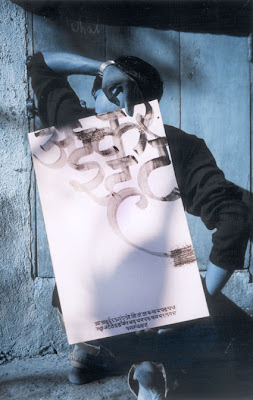
Anyway, summer is pretty much over, so I’ll start sharing some of the new links and work I’ve discovered. Let's start with the interesting work of Nikheel Aphale (not Nikhil!) of New Delhi, India. His blog felt so familiar to me... and I love his pieces which combine photography and calligraphy, like this.